Flow of Cancer Statistics
March 1, 2013
The analysis of statistical data about cancer occurrence is an essential task in epidemiology. It is considerable to identify risk factors in the early stage of occurrence. For this task the German Centre for Cancer Registry Data is collecting the cancer occurrence in Germany. The effort to collect cancer registry data is important to investigate shot-, mid- and long-term effects of cancer occurrence and the evaluation of health care policy measures targeting cancer prevention, early tumor detection, cancer treatment and care.
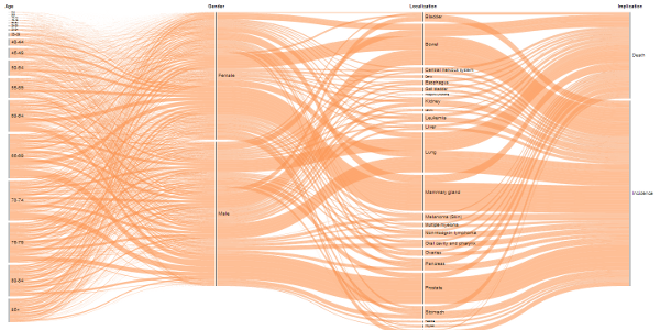
The challenge is that every cancer occurrence must be analyzed under different perspectives. Every occurrence contains information about the age, gender, localization of the cancer (e.g. lung) and implication. Through this multidimensional view the visualization of cancer statistics must cover these properties simultaneously. The choice was to visualize the cancer occurrence along these properties to allow the user a discovery process. If you have a massive data set it es necessary to recognize patterns or interesting relationships. The flow visualization helps you to identify cancer occurrence of specific groups and to see the value distribution along the other properties. Now it is easier to ask questions of relevance:
- How is the age structure by men with prostate cancer?
- What is the type of cancer with the highest number of incidences?
- Does exists gender specific types of cancer?
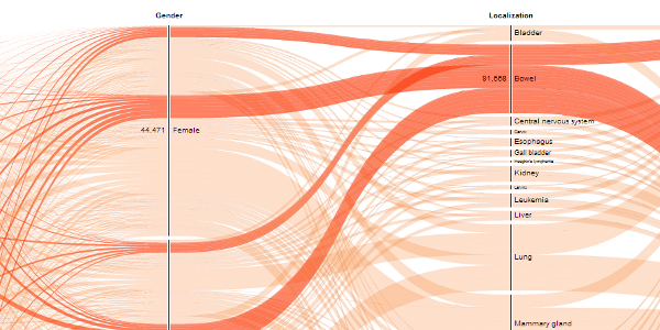
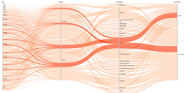
These questions can be answered with the provided structure of the visualization. Each vertical line represents one dimension (e.g. gender) and the total amount of cancer occurrence by every property. Each flow shows the total amount along the displayed dimensions. If you click on one property it is possible to see detailed flowes with specific values. After the click the specific flows are highlighted to discover the needed relationships. This is done by the use of transparency and color.
At the end the provided visualization helps to recognize relationships through a multidimensional view. In the development process the use of color, transparency and form is determining the perception of the user.


[...] Try out the visualization at http://www.visual-telling.com. [...]
this is the best sankey diagram i have ever seen.
do you mind share how did you do it?
thanks.
Thanks. Writing a Making-of can be pretty large because there are several topics like data modeling, web programming and the ideas behind the visualization. Maybe a special field of interest could be helpful.
thanks for the reply. i was too focused on the visualization part and almost forgot there are also lots of work besides that.
my question is about the visualization. say, in this example, we already have the pairwise links between age, gender, localization and implication. could you give some hints on how to visualize it in this fancy way? as far as i know, there is not a ready tool to generalize a sankey diagram like this.
thank you.
The technology behind this visualization is D3.js and is supporting the developer to handle multidimensional data from a visual perspective. In the next post i will describe it more in detail.
Dear Oliver
your visualization is very informative, but I’m really interested in the Making-of-This-Visualization ( the big process behind it). Do you have a published paper or chapters ( the more detailed the better) to help me understand the statistical analysis, classification, clustering methods behind the scene.
that would be great.
I welcome any suggestions from you including web-sites, references, articles and Blogs talking about thea construction of visualizations from scratch in Step-By-Step manner.
many thanks to you.
Yours Truly
waleed al hadban
Hello waleed al hadban,
the visualization is based on categorical data and mainly used in data warehouses or business intelligence applications. The goal of data warehouses is to provide data cubes for a multidimensional analysis.
You can find a scientific explanation of the visualization technique by
Kosara, Bendix, and Hauser. A tutorial is provided by Davies, which explains a vertical parallel set with hard edges.
Your suggestion about a Step-By-Step of visualizing categorical data is a really good idea. I keep this aspect in my mind for the next weeks.
Thanks
Oliver
Thanks again for your comment, helpful indeed.
and yes, a Step-by-Step approach is really necessary especially for the statistical phase (i.e. after collecting the data, which statistical or mining method goes with which data type or dataset) even a simple guide-lines will be very helpful .
best regards and thanks
[...] l’indique le billet de blog consacré à cette visualisation, la collecte de ces données des registres du cancer est important [...]
[...] l’indique le billet de blog consacré à cette visualisation, la collecte de ces données des registres du cancer est important [...]
[...] Cancer Statistics Grand Image Oliver Bieh-Zimmert The analysis of statistical data on cancer occurrence is an essential task in epidemiology. It is important to identify risk factors at an early stage of occurrence. For this task, the German Centre for Cancer Registry data is collected for the occurrence of cancer in Germany. Efforts to collect data from cancer registries is important to study-turned, the effects in the medium and long-term cancer incidence and evaluation of policy measures aimed at preventing health of cancer, early detection of tumors, cancer treatment and soins.Le challenge is that each occurrence of cancer should be analyzed from different angles. Each instance contains information on age, sex, location of the cancer (eg lung) and involvement. With this multidimensional visualization of cancer statistics should cover these properties simultaneously. The choice was to view the appearance of the cancer along these properties to enable the user a discovery process. If you have a mass of data made it es necessary to recognize trends or relationships interesting. The flow visualization helps you identify cancer occurrence of specific groups and to see the distribution of value along the other propriétés.Essayez visualization http://www.visual-telling.com . [...]
[...] out the visualization at http://www.visual-telling.com. Posted in Health Care Policy | Tags: Cancer, Highlighted, Large, Statistics, [...]
[...] out the visualization at http://www.visual-telling.com. Posted in Health Care Policy | Tags: Care, Health, Nice, photos, [...]